A customised, and accessible, Firebase login view controller. Part 1 - the UI
Want to add Firebase login to an iOS app, with support for various social media login options? Easy, just follow the steps on the Firebase website and you're all set.
// In a view controller, far far away...
func login(_ sender: UIButton) {
  guard let authUI = FUIAuth.defaultAuthUI() else {
    return
  }

  authUI.delegate = self
  authUI.providers = [FUIGoogleAuth(), FUITwitterAuth()]

  show(authUI.authViewController(), sender: sender)
}
The code above will prepare the standard Firebase authentication view controller, it's set up to show login options for Google, Twitter and standard Email & Password.
Here's what happens:
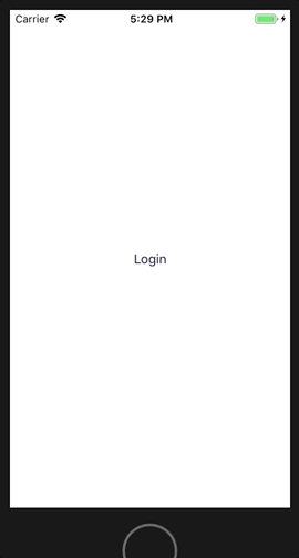
Ok, simple enough. If this design isn't to your liking you can customise the view controller to provide a different colour scheme for the background, or the navigation bar, add some nice images, change the button text by providing a different text bundle and a whole other load of stuff.
However the Firebase documentation tells us we can customise everything about the authentication method picker screen, except for the actual sign-in buttons and their position. This isn't great. Look what happens when we open the app with the largest Accessibility text size:

Unfortunately the standard Firebase authentication view controller does not support dynamic type. If we want to create an app that supports dynamic type (and we do!) then Firebase's authentication picker isn't going to cut it. We need to write our own.
A taster
Here's what we're going to make

Normal text size

Accessibility text size
The login screen will be a subclass of UIViewController, not the Firebase authentication picker screen, so we'll have to dive into the Firebase SDK a little to extract everything we need.
All the code for what we're about to do is available here
Authentication Providers
Social media login is represented by the FUIAuthProvider protocol. There are concrete instances of FUIGoogleAuth, FUITwitterAuth etc that handle almost everything we need when authenticating via these login methods.
The providers also give us styling information in terms of brand colour schemes and icons, which will come in handy, plus the text displayed in the buttons - localized to almost 90 different languages.
One thing to note is we will also be providing login via email and password in this example, but there is no concrete instance of an email FUIAuthProvider, so we'll have to handle that separately.
Some prep
When displaying large text sizes I shorten the text in the button to something that fits better within its bounds. I use the following protocol extension to check for when I should do that.
extension UITraitEnvironment {
  var isDisplayingLargeText: Bool {
    return traitCollection.preferredContentSizeCategory.isAccessibilityCategory
  }
}
Also, I'll need to access the Firebase bundle for some resources and localised strings, so I'll create a simple wrapper for the bundle
struct FirebaseBundle {
  static let loginLabel = "Login"
  static let emailIcon = "ic_email"
  static let bundleName = "FirebaseAuthUI"
  static let emailShortName = "Email"
  static let emailSignInLabel = "SignInWithEmail"

  private static let bundle: Bundle = {
    guard
      let firebaseBundleURL = Bundle.main.url(forResource: bundleName, withExtension: "bundle"),
      let bundle = Bundle(url: firebaseBundleURL)
    else {
      fatalError("Missing FirebaseAuthUI bundle")
    }

    return bundle
  }()

  static func localizedString(_ key: String) -> String {
    return bundle.localizedString(forKey: key, value: nil, table: bundleName)
  }

  static func image(named imageName: String) -> UIImage {
    guard let image = UIImage(named: imageName, in: bundle, compatibleWith: nil) else {
      fatalError("Invalid bundle contents")
    }

    return image
  }
}
Let's make the buttons
Here's a breakdown of the properties of the login buttons we want to make.
| Property | Implemented by |
| Round corners | layer.cornerRadius set to 20 |
| Dynamic text | Set font to subheadline |
| Self sizing for dynamic text | Make height ≥ 2 x corner radius |
| Button image | FUIAuthProvider.icon |
| Button text | FUIAuthProvider.signInLabel |
| Button text for large text sizes | FUIAuthProvider.shortName |
| Button background colour | FUIAuthProvider.buttonBackgroundColor |
| Button border colour | Same as the text colour if the background is white, otherwise clear |
Note the height constraint must be greater than or equal to otherwise the buttons won't resize for dynamic type.
Everything above is fine for Google and Twitter, but for Email we need to provide our own accessors for the same properties as there is no email FUIAuthProvider. The Firebase bundle FirebaseAuthUI provides an email icon (ic_email), plus all the localized strings for the button text. Buried somewhere in the example code is the RGB code for the button background colour too.
Here's a helper that gives us all that data
struct FirebaseEmailAuthentication {
  static let icon = FirebaseBundle.image(named: FirebaseBundle.emailIcon)
  static let shortName = FirebaseBundle.localizedString(FirebaseBundle.emailShortName)
  static let signInLabel = FirebaseBundle.localizedString(FirebaseBundle.emailSignInLabel)

  static let buttonBackgroundColor = #colorLiteral(red: 0.8156862745, green: 0.007843137255, blue: 0.1058823529, alpha: 1)
  static let buttonBorderColor = UIColor.clear
  static let buttonTextColor = UIColor.white
}
Now we know what we want from a provider, or the email defaults, we can define a view model for the button. It contains an optional provider and defaults to email if there is none provided
struct FirebaseLoginButtonViewModel {
  /// If the provider is nil we default to email
  let provider: FUIAuthProvider?

  var signInLabel: String {
    if UIScreen.main.isDisplayingLargeText {
      return provider?.shortName ?? FirebaseEmailAuthentication.shortName
    }

    return provider?.signInLabel ?? FirebaseEmailAuthentication.signInLabel
  }

  var icon: UIImage {
    return provider?.icon ?? FirebaseEmailAuthentication.icon
  }

  var buttonBackgroundColor: UIColor {
    return provider?.buttonBackgroundColor ?? FirebaseEmailAuthentication.buttonBackgroundColor
  }

  var buttonBorderColor: UIColor {
    return provider?.buttonTextColor ?? FirebaseEmailAuthentication.buttonBorderColor
  }

  var buttonTextColor: UIColor {
    return provider?.buttonTextColor ?? FirebaseEmailAuthentication.buttonTextColor
  }

  var buttonBorderWidth: CGFloat {
    return (buttonBorderColor == .clear ? 0.0 : 1.0)
  }
}
Note for signInLabel we check to see if we're displaying large text and return the appropriate string as needed.
Now we can create a button and pass it this view model.
class FirebaseLoginButton: UIButton {
  static let cornerRadius: CGFloat = 20.0

  private let viewModel: FirebaseLoginButtonViewModel

  init(with viewModel: FirebaseLoginButtonViewModel) {
    self.viewModel = viewModel
    super.init(frame: .zero)

    setup()
  }
}
Here we've set our corner radius as a constant so we (and other objects) can reference it later.
All we need now is to implement setup where we set the button's radius, border width, background colour, border colour, text colour, text and icon directly from the view model, which gets everything from the FUIAuthProvider or Email defaults.
private extension FirebaseLoginButton {
  static let inset: CGFloat = 16.0

  func setup() {
    titleLabel?.font = UIFont.preferredFont(forTextStyle: .subheadline)
    titleLabel?.numberOfLines = 0

    layer.cornerRadius = FirebaseLoginButton.cornerRadius
    contentHorizontalAlignment = .left

    backgroundColor = viewModel.buttonBackgroundColor
    layer.borderColor = viewModel.buttonBorderColor.cgColor
    layer.borderWidth = viewModel.buttonBorderWidth

    setTitle(viewModel.signInLabel, for: .normal)
    setTitleColor(viewModel.buttonTextColor, for: .normal)
    setImage(viewModel.icon, for: .normal)

    titleEdgeInsets = UIEdgeInsets(top: 0, left: FirebaseLoginButton.inset, bottom: 0, right: 0)
    imageEdgeInsets = UIEdgeInsets(top: 0, left: FirebaseLoginButton.inset * 0.667, bottom: 0, right: 0)
  }
}
In order to get dynamic text working we need to set numberOfLines to zero and, most importantly, we override the button's font to be one that supports dynamic text, so we use preferredFont(forTextStyle:). If we forget this part then the button text will remain a fixed height.
Getting the text and icon into the right position is a bit of a hack, but you can fiddle with insets and play around to see which works best for you. You can also play around with the button's reaction to being highlighted or selected for some visual feedback, but that's up to you.
It would be nice to create a view controller whose init method takes the FUIAuthProviders we want to support and for it to display the associated login buttons. To do this I'll define a simple struct that wraps an optional FUIAuthProvider, we need it to be optional because a nil FUIAuthProvider will correspond to email. I'll also create some static presets for the types I know in advance that I'll need
struct FirebaseLoginType {
  let authProvider: FUIAuthProvider?
}

// MARK: - Predefined login types
extension FirebaseLoginType {
  static let google = FirebaseLoginType(authProvider: FUIGoogleAuth())
  static let twitter = FirebaseLoginType(authProvider: FUITwitterAuth())
  static let email = FirebaseLoginType(authProvider: nil)
}
FirebaseLoginType.google is a login type wrapper for the FUIGoogleAuth concrete type, FirebaseLoginType.twitter the wrapper for FUITwitterAuth and FirebaseLoginType.email is a nil wrapper, because there is no FUIAuthProvider for email.
Creating the login screen
Let's start with the initialisation of the view controller, which we'll call FirebaseLoginViewController
class FirebaseLoginViewController: UIViewController {
  private let loginTypes: [FirebaseLoginType]
  private let onLogin: (Result<String>) -> Void

  init(with loginTypes: [FirebaseLoginType], onLogin: @escaping (Result) -> Void) {
    self.loginTypes = loginTypes
    self.onLogin = onLogin

    super.init(nibName: nil, bundle: nil)
  }
}
This view controller takes a list of logins we want to show, plus an onLogin callback that we'll call when login completes, which takes a soon-to-be-standard Result type.
So far, so good. I would point out that in a real world example I wouldn't use an Array but rather a Set<FirebaseLoginType>, to avoid unnecessary duplicates, but in order to do that I'd have to make FirebaseLoginType conform to Hashable which is out of scope for what I want to do here.
I'll need to display each of the buttons corresponding to the login type. I'll do that by creating each button and putting them into a UIStackView and positioning the stack view at the bottom of the screen.
private extension FirebaseLoginViewController {
  static let buttonSpacing: CGFloat = 24.0
  static let buttonWidth: CGFloat = 250.0

  func loginButton(for loginType: FirebaseLoginType) -> FirebaseLoginButton {
    let button = FirebaseLoginButton(with: FirebaseLoginButtonViewModel(provider: loginType.authProvider))

    button.translatesAutoresizingMaskIntoConstraints = false
    button.heightAnchor.constraint(greaterThanOrEqualToConstant: 2 * FirebaseLoginButton.cornerRadius).isActive = true
    button.widthAnchor.constraint(equalToConstant: FirebaseLoginViewController.buttonWidth).isActive = true

    return button
  }
}
I've hard coded the button width to 250 points. It's a good enough size on large and small screens.
As mentioned before, the button's heightAnchor is set to greaterThanOrEqualToConstant, to allow the button to self size with dynamic text.
Now in my viewDidLoad I will create my stack view, position it where I want it onscreen and add the buttons.
override func viewDidLoad() {
  super.viewDidLoad()

  title = FirebaseBundle.localizedString(FirebaseBundle.loginLabel)
  view.backgroundColor = .white

  let stackView = UIStackView(arrangedSubviews: loginTypes.map(loginButton(for:)))
  stackView.axis = .vertical
  stackView.spacing = FirebaseLoginViewController.buttonSpacing

  view.addSubview(stackView)
  stackView.translatesAutoresizingMaskIntoConstraints = false
  stackView.centerXAnchor.constraint(equalTo: view.centerXAnchor).isActive = true
  stackView.bottomAnchor.constraint(equalTo: view.safeAreaLayoutGuide.bottomAnchor,
                                    constant: -FirebaseLoginViewController.buttonSpacing).isActive = true
}
The loginTypes are turned into FirebaseLoginButtons by Array's map method loginTypes.map(loginButton(for:)). Isn't Swift just awesome?
And there we have it, all that remains is to instantiate this view controller somewhere, with the required login types and a suitable onLogin callback, and present it onscreen. Up to you if you do that in your root view controller or a coordinator. Here it is in the standard ViewController that's given to you each time you create a new project.
As you can see I pass [.google, .twitter, .email] as the login types and they're displayed onscreen in the specified order.
I haven't shown the onLogin implementation, it can be anything you want.
// The parent view controller
private extension ViewController {
  @objc
  func login(_ sender: UIButton) {
    let loginViewController = FirebaseLoginViewController(with: [.google, .email],
                                                          onLogin: onLogin)
    let navigationController = UINavigationController(rootViewController: loginViewController)

    let cancelButton = UIBarButtonItem(barButtonSystemItem: .cancel, target: self, action: #selector(cancel(_:)))
    navigationController.navigationBar.topItem?.leftBarButtonItem = cancelButton

    show(navigationController, sender: sender)
  }

  @objc
  func cancel(_ sender: UIBarButtonItem) {
    dismiss(animated: true, completion: nil)
  }
}
And now, here is your custom, dynamically resizing, Firebase backed, login screen, at two different text sizes. And, with no extra effort, this time in Japanese.


And we're done
In the next post I'll go into the details of how you will actually login using this screen.