Touchy-feely
I got a design requirement recently for a button to be placed in the bottom corner of the screen and for it to be the same distance from the trailing margin as the bottom.
As requirements go that's a pretty simple statement. And if your button has a background colour, then it's as simple as this:
But if your button has a clear background, you'll see you have a spot of bother:
Well, this isn't good, the button might be equidistant from the margins, but the text isn't. Details like this are important. We can realign the button by editing the content insets to remove the padding:
But now we have an even more glaring problem, the button's tappable area is tiny. In fact, in this example it's 44x13 points. We've all had that experience, perhaps with our own apps, where we tap a button and nothing happens because the button is too small and we missed the target. It's poor UX.
Adding a 44 point height constraint is just going to put us back to where we started, because the constraint will take precedence over the content insets. In fact, now the text is even more obviously not aligned with the margins.
So what do we do?
A naïve solution
We could add another button, behind the close button, giving it a larger surface area and hooking it up to the close button's action.
I've highlighted the second button, which is centred on the close button. The touch area is now a lot better, but this solution is a bit hacky, and it's just not scaleable.
Second iteration
We could use the same idea as above and programatically add a second button as a subview. We do that in the addTarget(_:action:for:) method, adding the same target-action to the subview button.
The subview button is centred on the parent button, and its dimensions are set to match the parent or be 44 points, whichever is larger.
This removes the scaling issue, but it has one major drawback. It doesn't work. The subview button will not receive a tap event outside the bounds of the parent button, so the tappable surface is still the small bounds of the Close button, our goal needs to be to programatically extend the tappable surface.
Third time lucky
First things first, buttons aren't the only UI controls that receive touch events, so I'm going to extend UIControl to have a better touch surface, not just UIButton. I'll do that with your favourite Swift trick, a protocol extension.
Now we subclass UIButton and adopt the ExtendedTouchable protocol
All that is left is to make the extended surface react to touches. Without going into the details of how touches are disseminated within a view hierarchy, a view with enabled user interaction will have its hitTest(_:with:) method called when the user interacts with the screen.
The hit test sends the touch point to the views in the hierarchy and, if a view can respond to the touch it returns itself, otherwise it returns nil. We can override this in our button to check if the touch event point lies within the tappable surface, not just the button's bounds
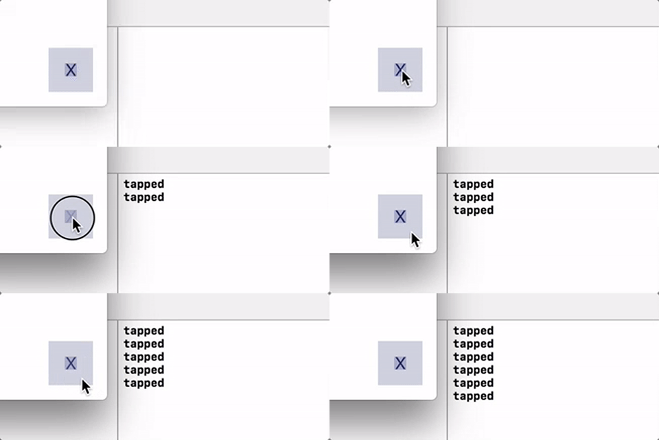
Quickly adding some background colours to the views, here's what we get with even the smallest of text buttons:
There are a number of simplifications in this example, I've created a more complete gist here.
Improving the solution
I'm not happy with having to add a subview, and I could have done without, using bounds calculations on the touch point in the hit test, but the ease of use of the subview is a bonus in writing a simple example.
I'm also not happy with having to create a subclass of a button, or any other control, in order to override the hit test. I have seen some solutions implementing an override of the hit test in an extension on UIButton, but this should be avoided at all costs. You should never override a method in an extension, only in a subclass.
An even better solution would be to use swizzling in UIControl and reimplement hitTest(_:with:). This would remove the need for not only a subview, but also a subclass. That way all buttons, sliders, switches etc would automatically have the extended touchable area by default, without the need to create new classes.
I don't need that for my purposes, so I don't want to overcomplicate my code, but if I find myself doing this too often, then I will probably consider it.
Quick plea!
By the way, I recently read a great post about a recent change in tappable areas in Apple apps, where they are becoming even larger than 44 points. I can't find that article any more. If you know they one I'm talking about, please drop a link to it in the comments!


